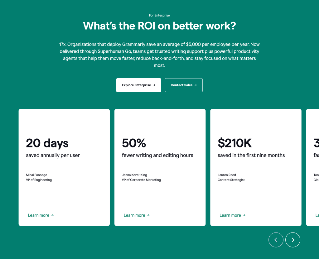
In this artcle we would explore 3 sites with good colour schemes
Betfred
Betfred is one of the leading betting companies in the UK, and as someone who has worked in the betting industry, I can’t ignore the brand colors they’ve chosen.
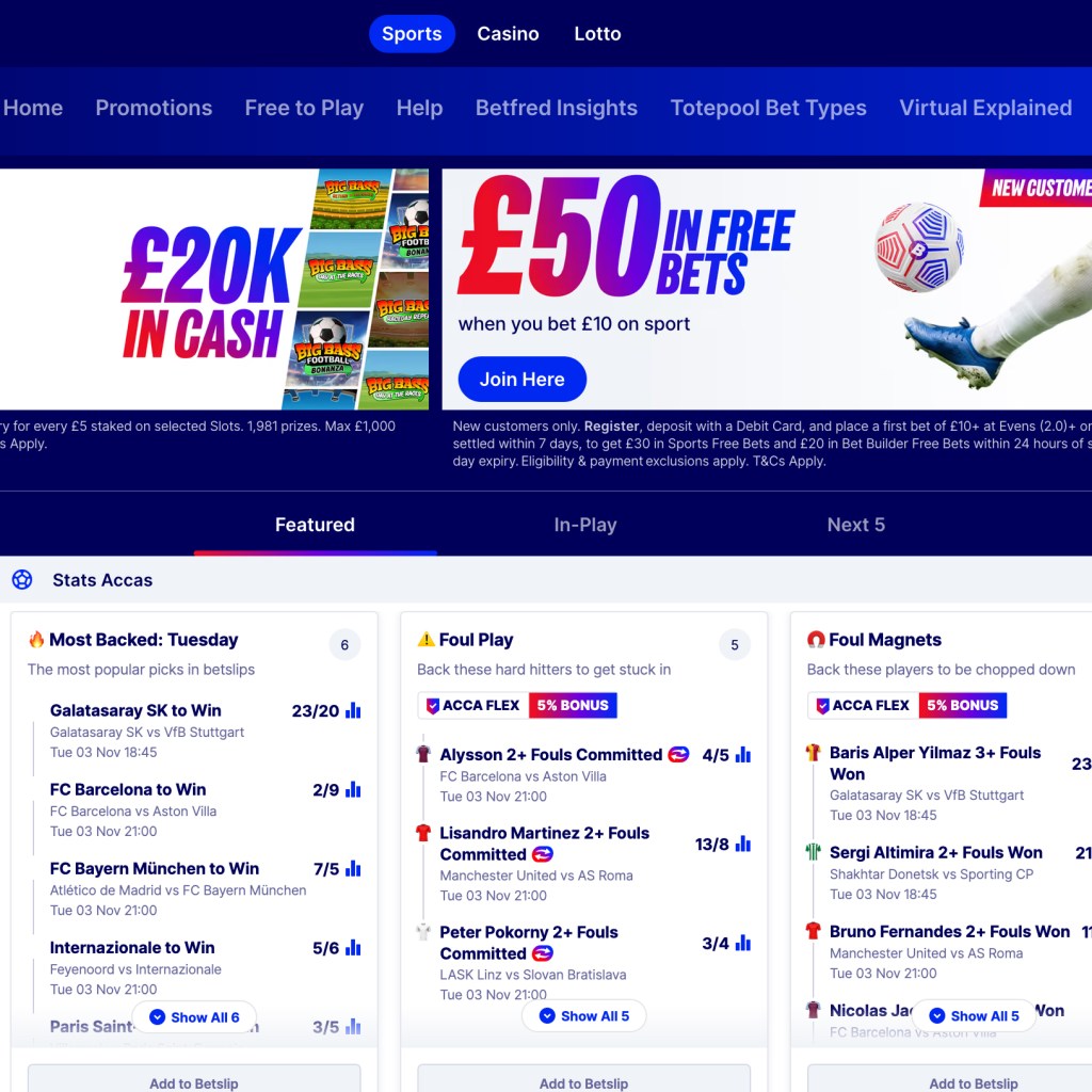
What drew me to this website was the gradient color selection, the combination of blue and red. I love this color combination and how it’s used. This is something that is rarely seen in the industry. I’ve never seen a brand use a gradient color combination this clean, and I somehow like how the blue is the most dominant color. In some cultures, blue or navy blue means security.
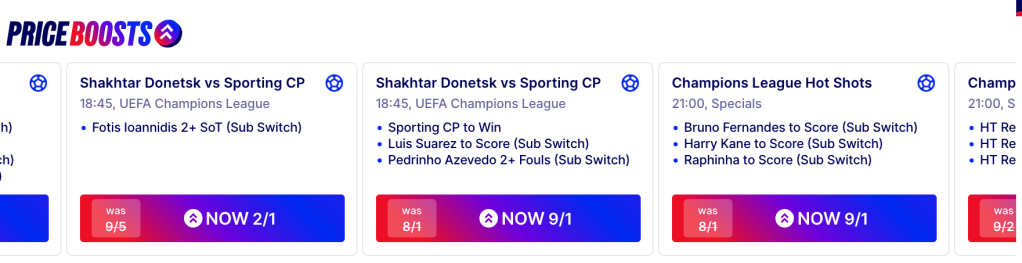
Also, I like how they use this gradient color in their printing and outdoor adverts. I have come across some of their outlets, and what makes it easy for me to remember this brand is the red and blue. This is indeed very iconic, and it clearly differentiates them from their competitors.
Finally, the striking shade of gray used for text creates balance and hierarchy amongst the information on the websites. They use their brand colors well.
Site: https://www.betfred.com/
Monzo
Monzo is one of the UK’s most popular online fintech firms. Their services span Europe, and they are best known for not charging transaction fees, setting them apart from many competitors.
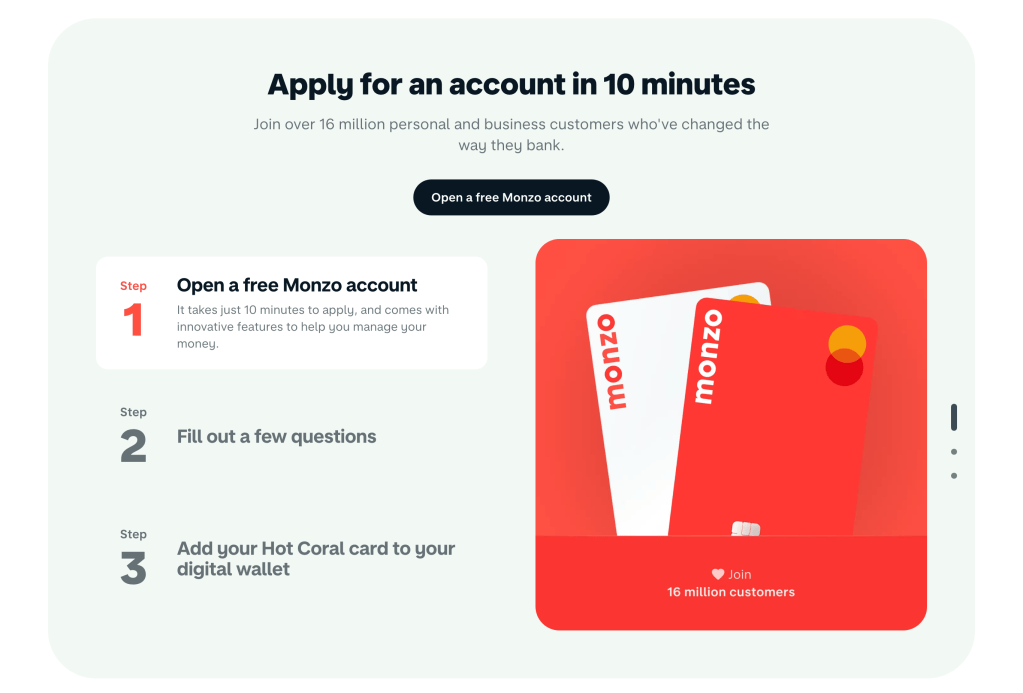
Over the past decade, most fintech companies have preferred green or blue, viewing these as the “safest” colors to use. Traditionally, green and blue have signaled financial security and wise choices. However, over the last five years, this trend has shifted, with brands letting project briefs guide color selection more freely. Monzo stands out as one of the few to break the mold, which is why they’re on my list. I especially appreciate their use of light red paired with off-black these colors work particularly well together in dark mode.

The image above demonstrates how Monzo minimized the use of primary colors. Instead, they use light red mainly to highlight key elements, creating emphasis. The contrast between the light red and dark blue is visually effective.
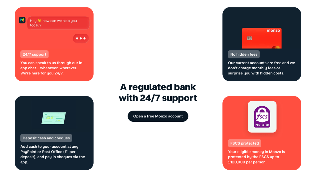
Finally, I appreciate that Monzo avoided using primary colors for their buttons. Instead of using light red for the buttons, they thoughtfully assessed each button’s importance and used dark blue to distinguish primary and secondary actions. This approach creates a balanced visual hierarchy and demonstrates careful consideration in their color choices.
Site: https://monzo.com/
Grammarly
Grammarly’s color choices made me realize that you don’t need many colors to create a visually appealing website. You can design something stunning using just one color, relying on its various tints and shades. In the image below, notice the dark shade of green used for the “Sign Up, It’s Free” button in the top right corner. Also, take a look at the same button in the center of the page. These are clear examples of what I mean.
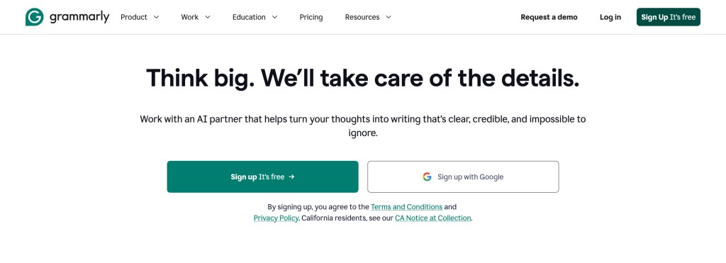
In the image below, they used green extensively for the fill. I believe this choice was made to help visitors focus on the highlighted area and to distinguish it from other sections on the website. Overall, I love how they relied on a single color palette for the entire site.