Categories
coding for web content

3 Examples of Websites with Good Colour Schemes

In this artcle we would explore 3 sites with good colour schemes

Betfred

Betfred is one of the leading betting companies in the UK, and as someone who has worked in the betting industry, I can’t ignore the brand colors they’ve chosen.
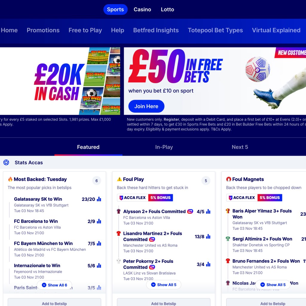
What drew me to this website was the gradient color selection, the combination of blue and red. I love this color combination and how it’s used. This is something that is rarely seen in the industry. I’ve never seen a brand use a gradient color combination this clean, and I somehow like how the blue is the most dominant color. In some cultures, blue or navy blue means security.
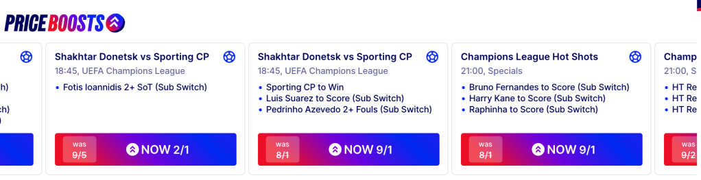
Also, I like how they use this gradient color in their printing and outdoor adverts. I have come across some of their outlets, and what makes it easy for me to remember this brand is the red and blue. This is indeed very iconic, and it clearly differentiates them from their competitors.

Finally, the striking shade of gray used for text creates balance and hierarchy amongst the information on the websites. They use their brand colors well.

Site: https://www.betfred.com/

Monzo

Monzo is one of the UK’s most popular online fintech firms. Their services span Europe, and they are best known for not charging transaction fees, setting them apart from many competitors.
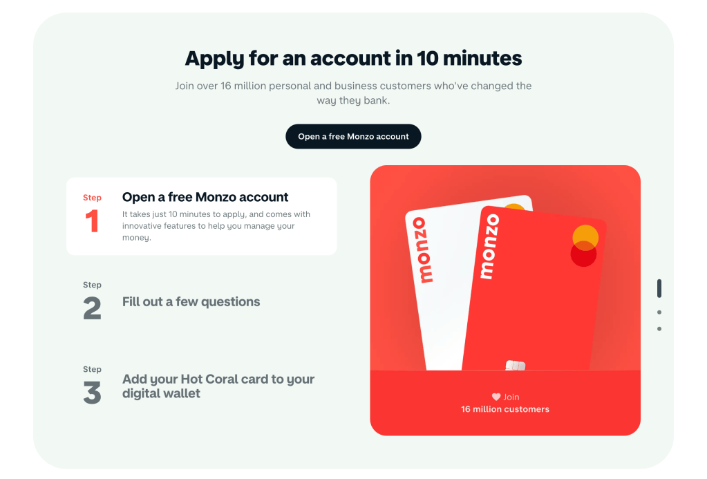
Over the past decade, most fintech companies have preferred green or blue, viewing these as the “safest” colors to use. Traditionally, green and blue have signaled financial security and wise choices. However, over the last five years, this trend has shifted, with brands letting project briefs guide color selection more freely. Monzo stands out as one of the few to break the mold, which is why they’re on my list. I especially appreciate their use of light red paired with off-black these colors work particularly well together in dark mode.
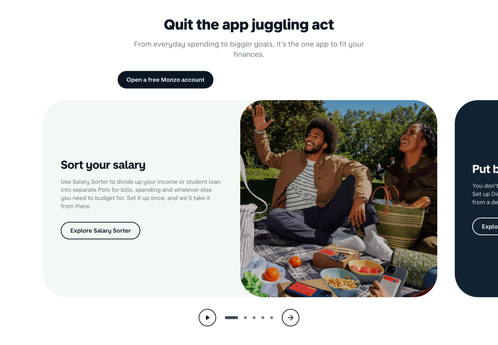
The image above demonstrates how Monzo minimized the use of primary colors. Instead, they use light red mainly to highlight key elements, creating emphasis. The contrast between the light red and dark blue is visually effective.
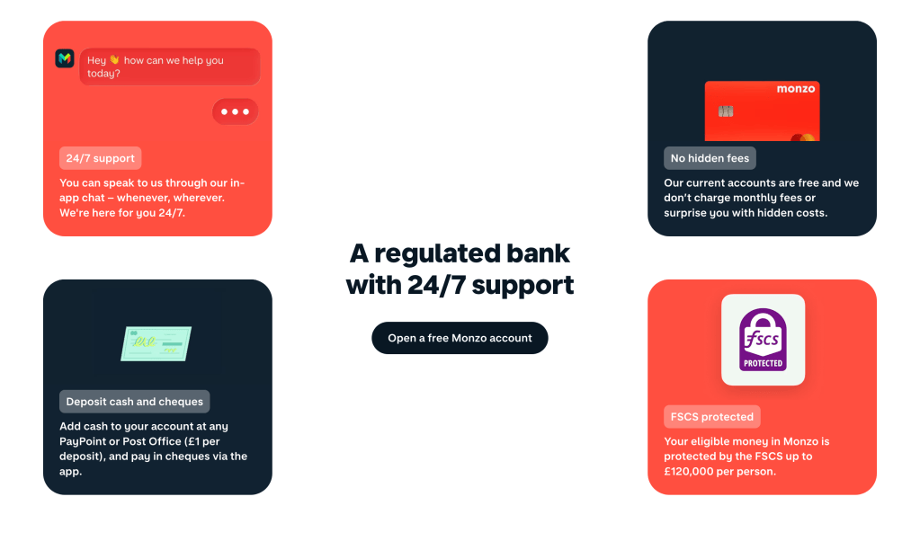
Finally, I appreciate that Monzo avoided using primary colors for their buttons. Instead of using light red for the buttons, they thoughtfully assessed each button’s importance and used dark blue to distinguish primary and secondary actions. This approach creates a balanced visual hierarchy and demonstrates careful consideration in their color choices.

Site: https://monzo.com/

Grammarly

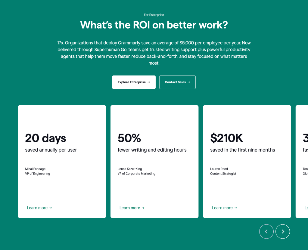
Grammarly’s color choices made me realize that you don’t need many colors to create a visually appealing website. You can design something stunning using just one color, relying on its various tints and shades. In the image below, notice the dark shade of green used for the “Sign Up, It’s Free” button in the top right corner. Also, take a look at the same button in the center of the page. These are clear examples of what I mean.
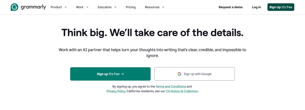
In the image below, they used green extensively for the fill. I believe this choice was made to help visitors focus on the highlighted area and to distinguish it from other sections on the website. Overall, I love how they relied on a single color palette for the entire site.

Site: https://www.grammarly.com/

Categories
coding for web content

3 Examples of Websites with Beautiful Typography

In this artcle we would explore 3 sites with exceptional use typography.

Eladio Dieste Website

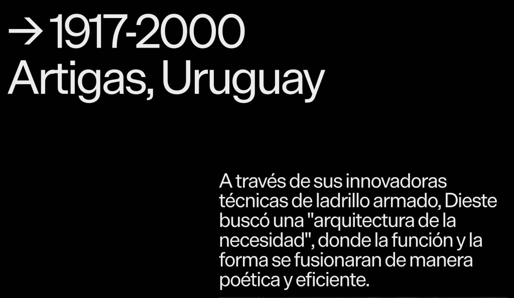
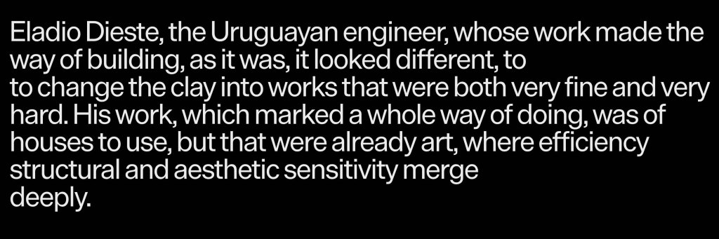
I like how they use typography to create hierarchy on this website. The large type really gives character to the website.

I like how they use typograpgy to create hirerchy on this websites, the large type really gave charater to this websites.

Similar to what I mentioned earlier, I also like the typeface itself.

The text reads from left to right, making it easy to read. However, one could argue that the text is quite squeezed together, but I think it matches the overall flow and idea of the website.

Site: https://www.eladiodieste.com/

Carrière Scène Website

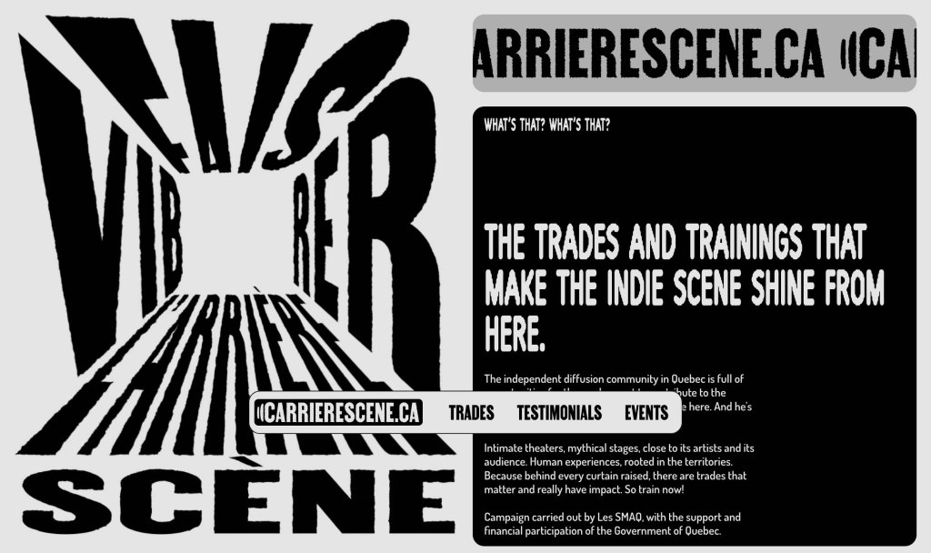
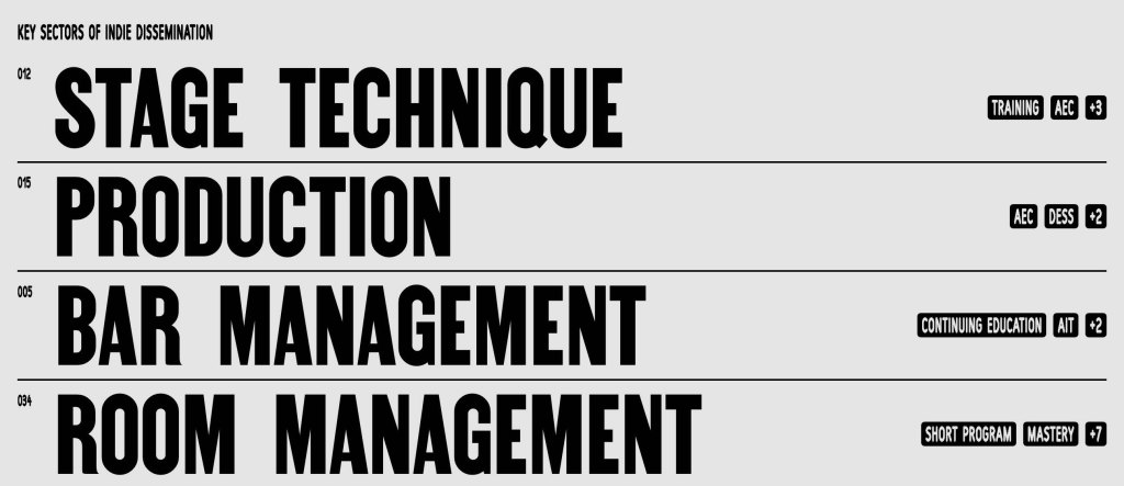
The Carrière Scène website is a career guidance and educational platform created to introduce people to career opportunities in Québec’s independent music and live entertainment industry.

Amongst all the websites, this is one of my favourites. I love how it uses typography to create the layout on the left. I feel this is a website you can easily remember and won’t forget. The large, bold text, combined with the distorted words and characters, really made this one of my top picks.

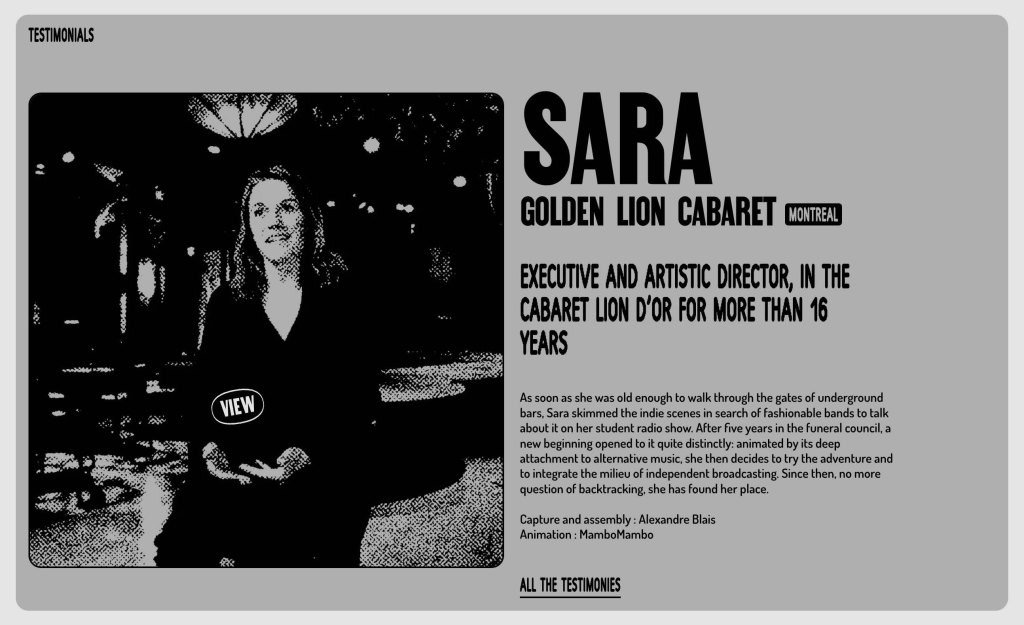
I also like how it uses a comic-style font alongside a sans-serif font in its layout. Since it’s a training website, I believe the designer combined these typefaces for that purpose.

Here’s another reason why I like this website, I love how bold and pronounced the texts are.

Site: https://carrierescene.ca/

Walaszczyk Studio

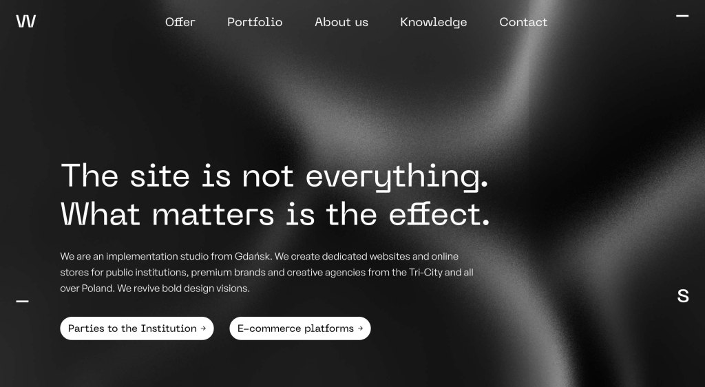
This is a portfolio website of Lukasz, a Polish web developer. Its purpose is to showcase his studio’s services and previous projects.

This is one of my least favourite websites. I like how the characters of the sans-serif typeface are designed. I also love how the designer combines light and semi-bold font weights to create contrast and hierarchy.

Site: https://walaszczyk.studio/

Categories
coding for web content

What I learned this week(26-10-07)

This article contains details on what I learnt this week (2026-10-07)

  1. I learned about the introduction to Cascading Style Sheets (CSS), who came up with the idea, why it was introduced, and one of the people who advocated for its use.
  2. I learned the major components of CSS, including selectors, declarations, properties, and values
  3. I learned that CSS uses rules to describe how HTML elements should look on a webpage.
  4. I learned how to link a CSS file to an HTML document.
  5. I learned about the Meyer CSS Reset and how it removes default browser styles before applying my own CSS styles.
  6. I learned about CSS colours, including named colours, RGB values, and alpha values, which control colour transparency.
  7. I learned about the CSS box model and the importance of understanding padding, borders, and margins.
  8. I learned that padding is the space between an element’s content and its border, and that the background colour extends into the padding area.
  9. I learned about the ⁠ box-sizing ⁠ property and the importance of using ⁠ border-box ⁠.
  10. I learned how to apply values to margins and padding using the clockwise order.
  11. I learned about inheritance and understood that some CSS properties are inherited by child elements while others are not.
  12. I learned about the cascade and how one CSS rule can override another rule.
  13. I read Chapter 4 of Learning Web Design, where I learned more about ⁠ border-radius ⁠, margins, margin collapsing, box shadows, and ⁠ display: block ⁠.

User Expereince Design for Web

  1. I learned what design principles are, how to implement them, and why they are important in design.
  2. I understood the concept of balance as a design principle and learned the difference between symmetrical and asymmetrical balance.
  3. I learned about dominance, its role in design, and how it helps draw attention to important elements in a composition.
  4. I understood the difference between art and design and learned the importance of balancing aesthetics, functionality, and sustainability to create solutions that serve the public.
  5. I learned why ideation is important in design and how it helps designers explore different ideas before choosing a solution.
  6. I understood the concept of a brain dump and how it can help designers put their thoughts and ideas on paper.
  7. I learned about sketching in design and how it helps communicate and explore ideas visually.
  8. I learned about the design process and the importance of following a structured approach when developing design solutions.
  9. I understood the concept of a target group and why designers need to consider the people they are designing for.
  10. I learned about composition, visual hierarchy and focal points, and how these concepts work together to communicate a design effectively.
  11. I understood how to make an element dominant in a composition and learned about the three stages of dominance.
  12. I learned about the concept of unity and its importance in bringing different elements of a design together to create a cohesive composition.
Categories
coding for web content

What I learned this week(26-09-30)

This article contains details on what I learnt this week (2026-09-30)

Coding for Web Content

  1. I understand the difference between tags and elements in HTML.
  2. I also learned what void elements are.
  3. I understand how to set up my HTML document the head, body, character set, title, and overall structure.
  4. I also read the Web Standard Model and I learned a lot. One of the main things I learned was how to use the model correctly to design responsibly and honour the legacy of the web’s pioneers. This really shifted my mindset.
  5. I learned the implications of using the model wrongly and what I stand to gain when I stick with this model.
  6. I researched and understood how file paths work in HTML and how to use the anchor element to reference or link sites. I also understand what absolute and relative URLs are.
  7. I learned how HTML and XHTML treat void elements.
  8. I understand how to write image elements in HTML.
  9. I understand why HTML is called a declaration language.
  10. I learned how to properly indent my code.
  11. I ran into many problems while doing my homework and I was able to sort them out. This challenge taught me the importance of properly structuring code and connecting my files to a server.

User Experience for Web

  1. For a long time, I’ve been designing in software such as Photoshop and Figma, but I’ve never really understood how important file naming and structure are.
  2. This week, I learned how to document, plan and present my work or projects to clients. I also practised the correct way of naming my layers and documents.
  3. I learned why it is important to document my files properly and the best way to organise and back up my work using third-party storage in case of hard drive damage or a computer system failure.
  4. I learnt how few details, such as uppercase letters, can invalidate your code in HTML.
  5. I also learnt the order of how to make raw images ready and compatible for the web, and the key processes to achieve that.
  6. I learnt how to manage iterations from clients and how to document them.

Categories
coding for web content

3 Examples of Good Websites.

In this article, we will look at three examples of good websites. We will explain why we think each one is good and share the link to each site.

1. SportyBet

Website https://www.sportybet.com/ng/

Sportybet is the leading betting company in Nigeria and the number 1 betting company in Africa. As of August 2025, Statista reported that Sportybet was the 3rd most-visited website in Nigeria. This wasn’t just because of its marketing, many users in Nigeria found the website easy to use and very fast.

Registration

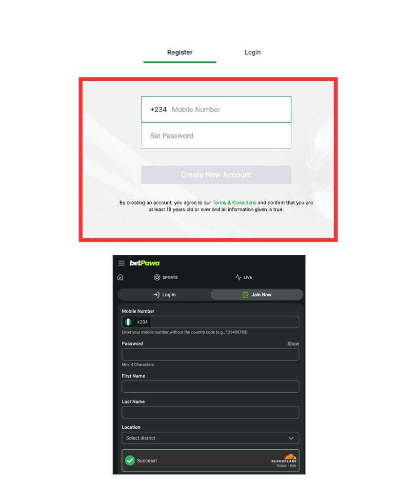
The registration process on Sportybet is very fast and seamless. They only request two essential credentials, which are a telephone number and password. Most betting companies will pack their registration screen with long forms, which can sometimes be overwhelming also, you can get your OTP in less than 30 secs.

Instant Registration Option

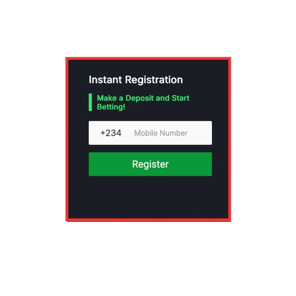
Not many betting companies offer this feature, but SportyBet does, and it’s said to be faster than the default registration. This feature was specifically designed for people who want to bet right away. SportyBet understands that not everyone is a new player hence, it offers a simple registration process for those who are not new to betting.

Layout and Page Structure

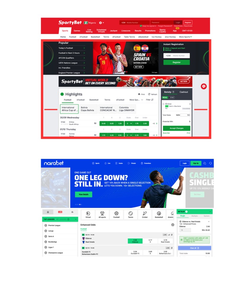
SportyBet website looks nicer than other platforms. They use a special layout size that is easier on the eyes and less tiring. Instead of using the full screen width, they limit it and fit the design inside. This layout lets users see a lot at once.

Content Strategy

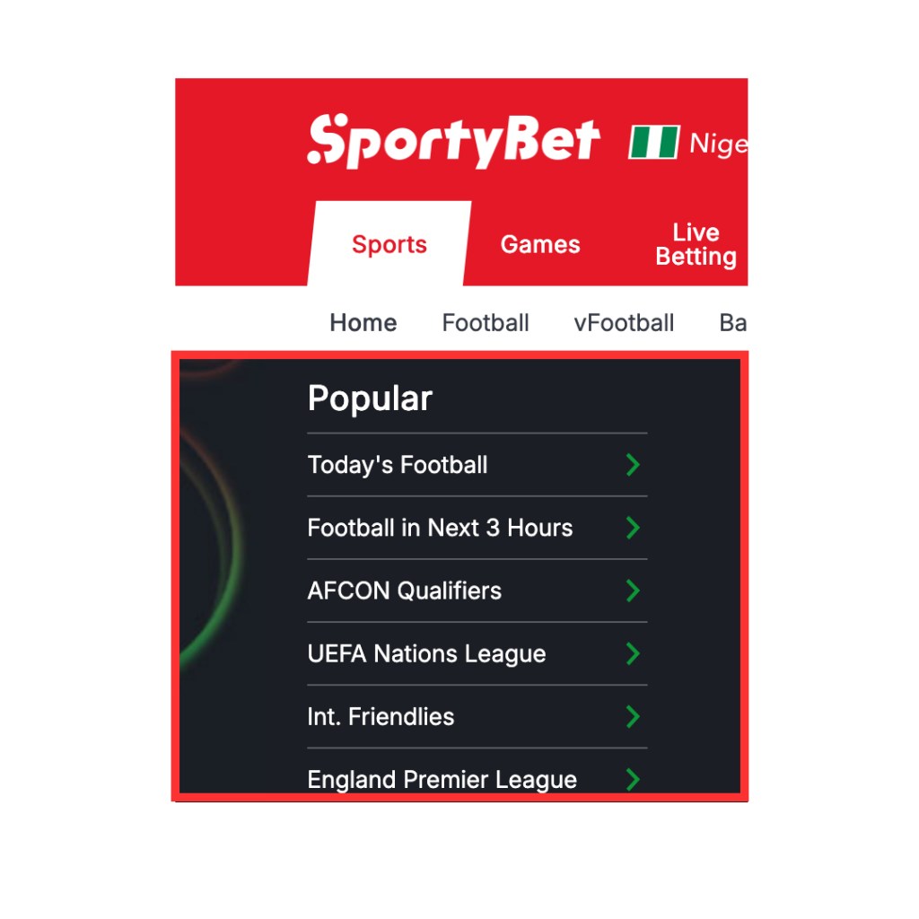
Sportybet knows that time is valuable in betting, so they created the “popular section” on the website. This helps users see what is happening today, like football games in 3 hours and ongoing tournaments. I think this helps users quickly find matches at any time of day. Few platforms offer this on their sites.

2. Rare Beauty

Website https://www.rarebeauty.com/

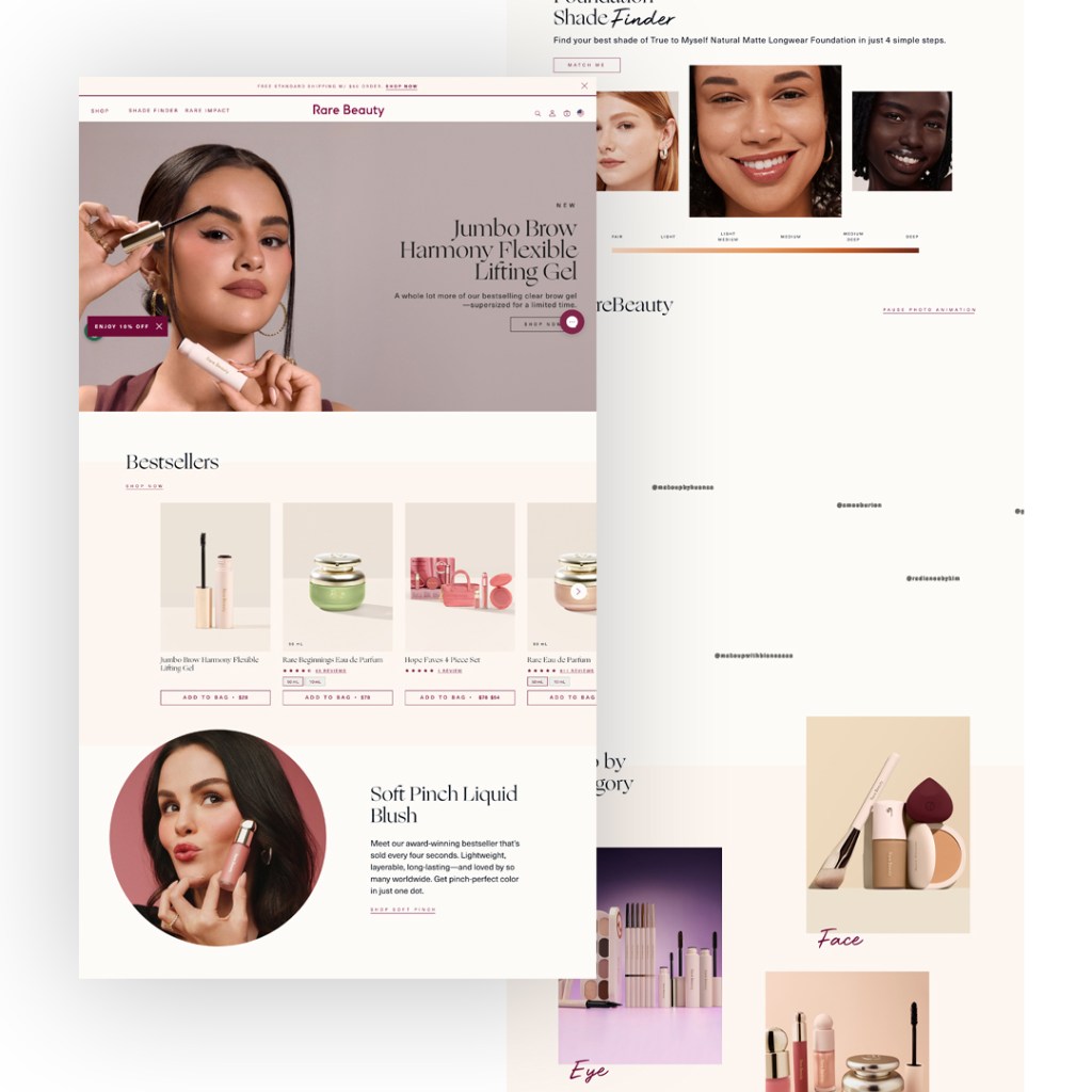
Rare Beauty is an online store that sells beauty products and it is owned by Selena Gomez.

This website really stood out to me, not because I shop here regularly, but because I like the functionality and aesthetics of this page. It understands the target audience, and you can tell they were intentional about their color and design choices.

I’m impressed by how they avoided the usual e-commerce design, with distracting banners and constant 50% off sales. Instead, Rare Beauty takes a more thoughtful and unique approach.

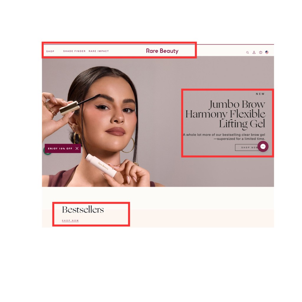
Typography

I love how the website combines different fonts. Adding a serif font in the right places makes the site feel exclusive and clean. The font choices also complement the layout well.

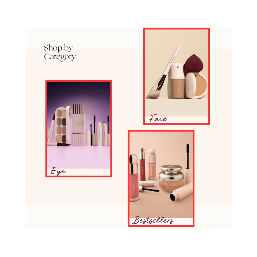
Photography

Research shows that high-quality photos and videos can increase customers’ willingness to buy. I like how the photos on this website match and reflect the brand’s colors. I especially appreciate e-commerce websites that invest in great product photography.

Layout

As I mentioned earlier, I like how this website presents its content. The layout isn’t just a row of boxes from left to right. The use of white space gives the design room to breathe and makes it more visually appealing.

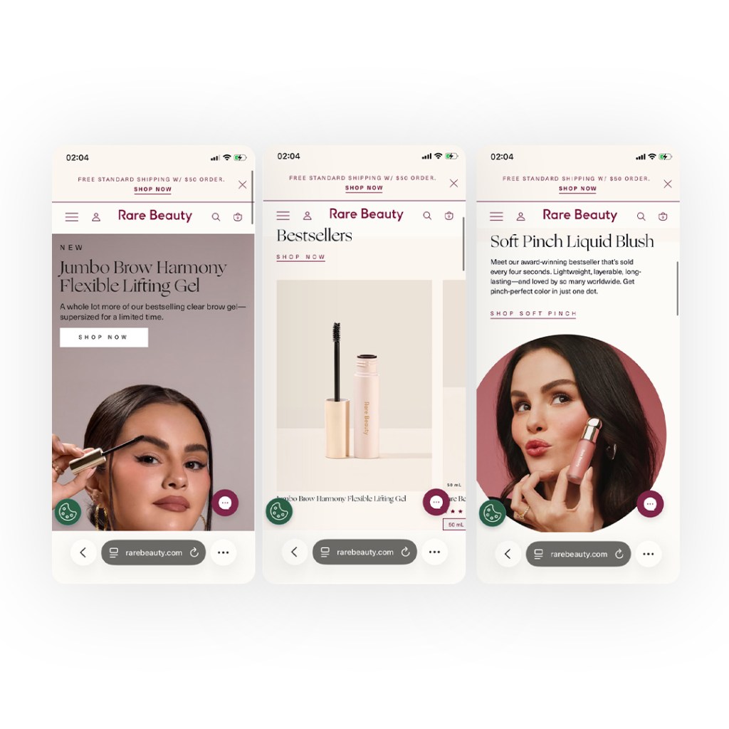
Responsive

Finally, the website looks great on mobile devices. I expected the layout or some content to break, but everything stays in place and remains responsive.

3. Removal.ai

Website https://removal.ai/

Removal.ai is an online AI-powered tool that quickly removes backgrounds from images. I’ve been using this website since 2024 because it’s simple and delivers fast results. As a guest user, I don’t need to sign up before I start removing the background from any image

Hero Message

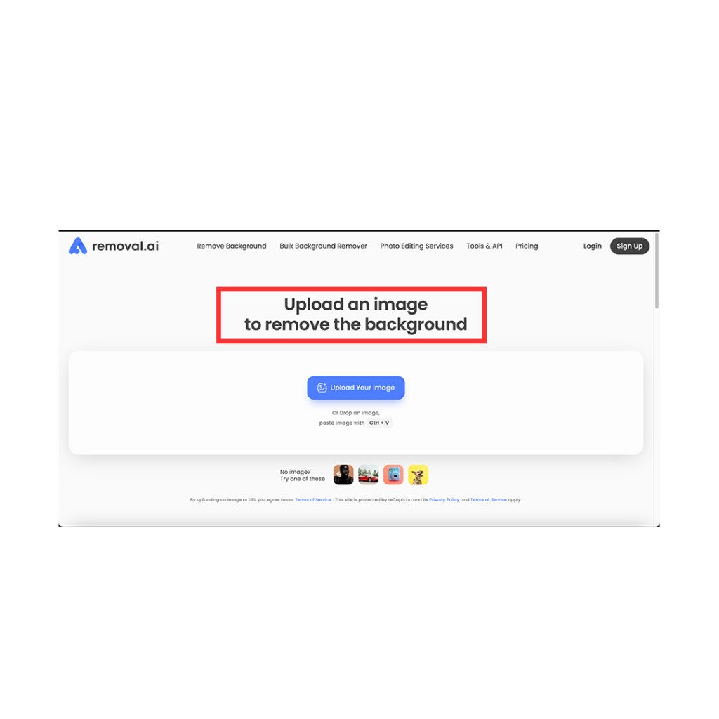
The message, “Upload an image to remove the background,” clearly tells users what action to take.

Shortcut (Cmd + V)

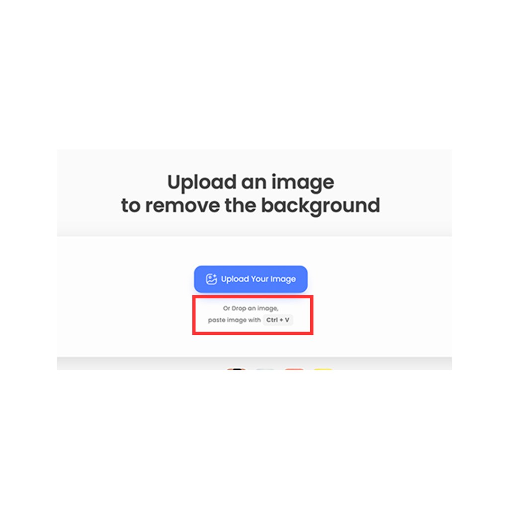
On this website, you can simply copy and paste an image, skipping the usual upload process. Many websites don’t communicate this feature, but it is clearly stated on removal.ai

Color Usage

I like how the website uses its layout, colors, and subtle interactions. These elements make the site easier to use

Bulk Uploading

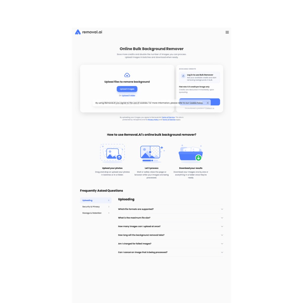
Bulk upload is a recently added feature that lets users remove backgrounds from multiple images at once. However, it’s currently unavailable for guests you need to log in to access it.

In conclusion, I like that the website is straightforward and uses plenty of white space.

Categories
coding for web content

3 Examples of a Good Design

In this article we will be looking at three examples of a good design (not websites). This will include a clear description of the product, why we chose the product and why we think the products are well designed.

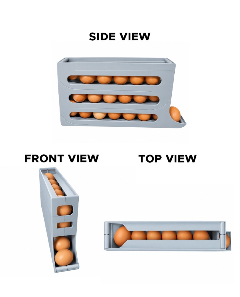
1. Egg Dispenser

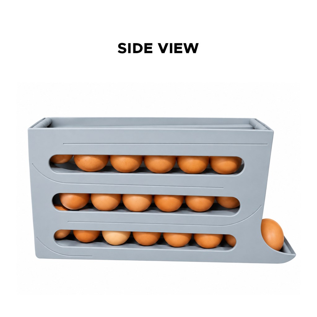
Nobody could have predicted years ago, that we would have an egg dispenser like the one shown above. The product’s intriguing design was one of the reasons I selected it. I would describe this as a “modern egg dispenser” because of its distinctive form and how quickly it adjusts to our surroundings. It demonstrates how quickly the world has changed.

This egg dispenser is well designed for the following reasons:

  1. It holds up to 20 eggs at once, which is plenty for larger households.
  2. It’s very convenient to carry with one hand, unlike a traditional crate, which you have to hold on both sides and still need to be extra careful with.
  3. The egg dispenser has 3 large, rounded holes on each side, designed to expose the eggs to ventilation and help prevent spoilage.
  4. This egg dispenser also takes up less space in the kitchen cabinets than the traditional egg crate.
  5. This egg dispenser is very easy to clean. You can detach it to clean it when it’s dusty or stained, which helps keep eggs clean and safe to eat.
  6. The egg dispenser is also made of plastic, which is a big plus. If it drops to the ground, it’s still reusable with minimal or no damage.
  7. Another good thing about this egg dispenser is that when you add a new set of eggs to the existing ones, you can only access the older eggs. This helps store the newly added eggs until the older ones have been dispensed.
  8. The line patterns on the dispenser show new customers how it works.
  9. The egg dispenser has a textured surface to prevent it from slipping

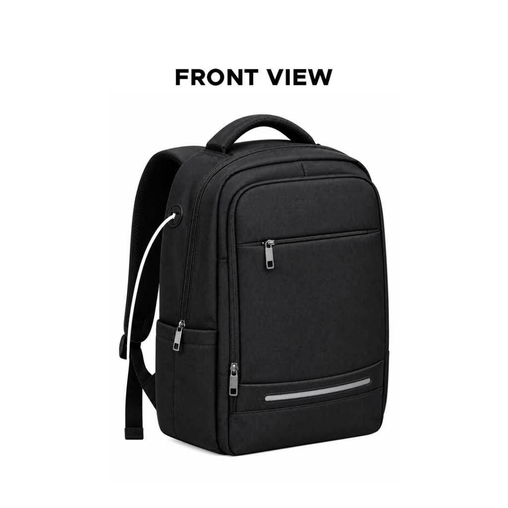
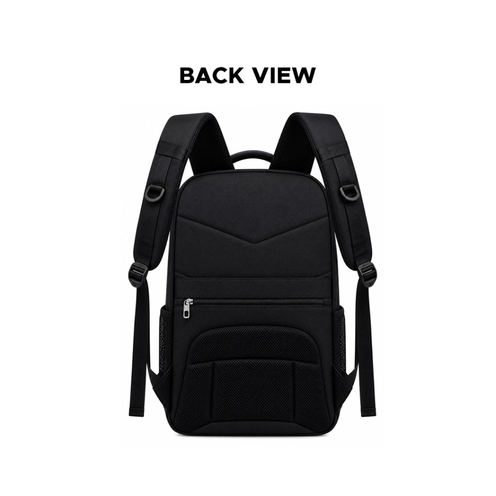
2. Backpack or School Bag


I genuinely like this backpack because it was designed to solve problems I never imagined a bag could solve. It doesn’t just serve the primary function of carrying items, as we all know.

This school bag is well designed for the following reasons:

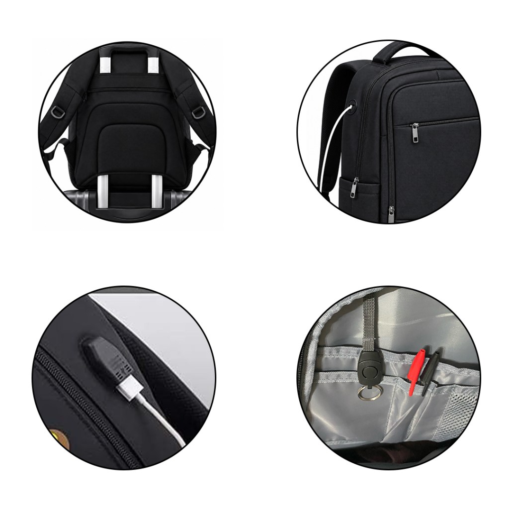
  1. The extra zipper at the back allows for quick access to your belongings without opening the entire bag. This feature also protects your privacy, as you can retrieve items discreetly through the back zipper rather than exposing the main compartment.
  2. Most backpacks usually have a transparent side pocket, but this one was designed to cover it. I find this useful because I often keep my phone in the side pocket for easy access, and I don’t expect everyone to see what’s in there.
  3. USB charging for mobile devices is another reason why I think this product was designed well, especially for students and workers. It lets them charge on the go.
  4. The backpack’s main area consists of only two sides. The first side is the main area, with an additional section within it for books and other items. I like that there are only two layers. I find it easy to search for an item; I remember my previous backpack, which had 3 layers within one section. Items sometimes get lost within the bag.
  5. Also, the zip was created with purpose; the transparent zip section for cards helps me identify the correct card that needs to be selected. This helps me visualise exactly what I need before reaching in to pick one.
  6. The bag is travel-friendly, with an overlapping empty space at the back where the travel box handle could easily be pulled in and out. This even makes it more remote.
  1. Additionally, the biro area which accommodates more than two biros was created specifically for this reason. The bag also includes a key holder, and its best feature is that it fits behind a cover so that not everyone can see what’s inside.
  2. Finally, the bag features a convenient corner port that allows me to plug in my charging cable while keeping my power bank securely inside the bag.

3. Laundry Basket

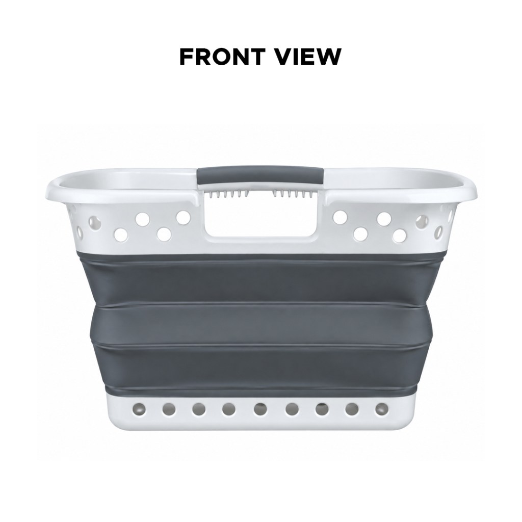
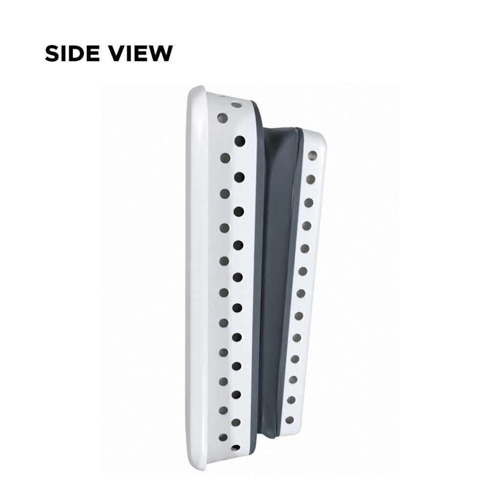
I like this product because it was designed for laundry use; it helps you move your washed clothes around the house easily and conveniently. It’s very helpful for a big family, especially when spinning a large amount of clothes

This laundry basket is well designed for the following reasons:

  1. The laundry basket has rounded holes scattered around the basket; this will create ventilation to enable clothes to drain faster and also dry on time without having to spread them.
  2. It’s also collapsible, which enables users to keep it in a small corner without taking up too much space
  3. The laundry basket handle is ergonomically designed for a comfortable and secure grip.
  4. Also, it uses plastic with holes, which requires less material and makes the basket easier to carry
  5. The ribbed design adds rigidity to the handle so it doesn’t deform as much when the basket is full
  6. The openings make it easy to see what’s inside, so you can quickly find items without searching through the entire basket.
  7. This basket could also be reusable to store children’s toys, balls, etc.
  8. This basket can also be used in public spaces, such as picnics, to store food and vegetables. The ventilation holes keep the contents fresh by allowing air to circulate